Last week we looked at one way to display data, the stem-and-leaf plot. This time, we’ll look at a very different one, the box-and-whisker plot, which summarizes the data more broadly.
Constructing a box plot
We’ll start with this question from 2000:
Box and Whisker Plots

I don't understand box and whisker plots. All I know is that a box and whisker plot is used to display data. I can't find information on this anywhere else.
Doctor TWE answered:
Hi Ramiro - thanks for writing to Dr. Math.

A box-and-whisker plot (often simply called a box plot) is a graphical way of showing data. It is useful for quickly finding outliers - data points out of line with the rest of the data set.

Suppose we want to construct a box plot of the following test scores:

  50, 60, 73, 77, 80, 81, 82, 83, 84, 84, 84, 85, 88, 95, 100

If they're not already in numerical order, it's best to arrange them in ascending order.
This is needed in order to find quartiles. (As we’ve seen, one way to put them in order is to construct a stem-and-leaf plot.)
Making the box
First, we need to construct the "box." To do so, we must find the upper and lower quartiles and the median. The median is the number in the middle of our set (when arranged in numerical order). The upper and lower quartiles are the values 1/4 of the way from the top or bottom of our set. In our example:

  50, 60, 73, 77, 80, 81, 82, 83, 84, 84, 84, 85, 88, 95, 100
               ^               ^               ^
              L.Q.           Median           U.Q.
We’ll discuss how to find quartiles below.
To draw the box, we'll put a scale on the x-axis and draw a box from the lower quartile to the upper quartile. We'll add a vertical line to mark the median, like so:

                             LQ     M UQ
                              +-------+
                              |     | |
                              +-------+
   ^.........^.........^.........^.........^.........^.........^
   50       60        70        80        90        100       110

     where LQ = Lower Quartile, M = Median, UQ = Upper Quartile.
So the box contains the middle half of the data, with a wall at the very middle, separating the second and third quarters of the data. It’s width is called the interquartile range.
Fences
Now we add "fences." First, we compute the inter-quartile range (IQR). The IQR = UQ - LQ. So in our example IQR = 85 - 77 = 8. The inner fences are 1.5*IQR below the L.Q. and 1.5*IQR above the U.Q. For our example, the inner fences are at:

              77 - 1.5*8 = 77 - 12 = 65
     and at   85 + 1.5*8 = 85 + 12 = 97

We'll mark these with a dotted line (I'll use colons ":"). Sometimes the fences are not drawn on the box plot, but we'll put them in so we can see where they are:

                 LIF         LQ     M UQ         UIF
                  :           +-------+           :
                  :           |     | |           :
                  :           +-------+           :
   ^.........^.........^.........^.........^.........^.........^
   50       60        70        80        90        100       110

     where LIF = Lower Inner Fence, UIF = Upper Inner Fence.
Here the distance from LQ to LIF, and from UQ to UIF, is 1.5 times the distance from LQ to UQ.
There is also a set of outer fences. These are 3*IQR below the L.Q. and 3*IQR above the U.Q. For our example, the outer fences are at:

              77 - 3*8 = 77 - 24 = 53
     and at   85 + 3*8 = 85 + 24 = 109

We'll mark these with another dotted line. These are always twice as far out as the inner fences. Here's what we have so far:

     LOF         LIF         LQ     M UQ         UIF         UOF
      :           :           +-------+           :           :
      :           :           |     | |           :           :
      :           :           +-------+           :           :
   ^.........^.........^.........^.........^.........^.........^
   50       60        70        80        90        100       110

     where LOF = Lower Outer Fence, UOF = Upper Outer Fence.
Here we went that same distance further to make the new fences. You might think of the fences as something like the outfield fence in a baseball stadium that marks automatic home runs.
Whiskers
Now we add the "whiskers." Find the first value above (to the right of) the Lower Inner Fence. Mark it with an X and draw a line connecting it to the box. Similarly, find the first value below (to the left of) the Upper Inner Fence. Mark it with an X and draw a line connecting it to the box as well. In our example, the end values for our whiskers are at 73 (the first value above 65) and 95 (the first value below 97.) Our plot now looks like this:

     LOF         LIF         LQ     M UQ         UIF         UOF
      :           :           +-------+           :           :
      :           :       X---|     | |---------X :           :
      :           :           +-------+           :           :
   ^.........^.........^.........^.........^.........^.........^
   50       60        70        80        90        100       110
What we’ve done here is to include the rest of the data as “whiskers” projecting from the box, but cut off any part of the whiskers that would extend past the inner fences.
Outliers
Finally, we have to mark the outliers. Values between the inner and outer fences are called "suspect outliers." We mark them with an asterisk "*".

Values outside the outer fences are called "highly suspect outliers." We mark them with an "o". In our example, we have two suspect outliers: the 60 and the 100. We also have one highly suspect outlier: the 50. Once we mark these on our plot, we're finished:

     LOF         LIF         LQ     M UQ         UIF         UOF
      :           :           +-------+           :           :
   o  :      *    :       X---|     | |---------X :  *        :
      :           :           +-------+           :           :
   ^.........^.........^.........^.........^.........^.........^
   50       60        70        80        90        100       110
We’ll discuss later what makes these outliers important.
We could "erase" the fences and labels, but I'd probably leave them in so that the person looking at the graph can see where they are. If we erase them, we'll have:

                              +-------+
   o         *            X---|     | |---------X    *
                              +-------+
   ^.........^.........^.........^.........^.........^.........^
   50       60        70        80        90        100       110
I’ve seen introductory presentations that omit the distinction of outliers, and therefore don’t mention fences.
As you can see, this plot quickly gives an idea of what our data look like. Half the numbers are between 77 and 85, the middle of the data set is at 83, the "reasonable" range of the data goes from 73 to 95, and we have three suspect data values at 50, 60, and 100.

A nice feature of this kind of plot is that all the computations are relatively simple. We never had to do anything more than add, subtract, and multiply by 1.5 and 3.
What they really look like
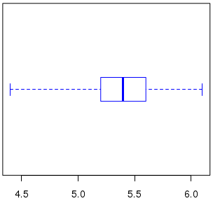
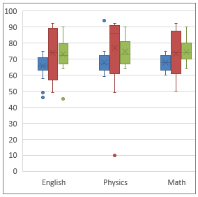
Here are some examples of actual box-and-whisker plots, to show some of the variation in style:
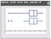
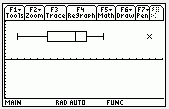
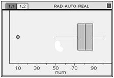
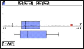
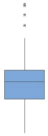
R:
Finding the quartiles
Another question, from a teacher in 2000, asked for details on the calculation of the quartiles:
Box and Whisker Plots

Dear Dr. Math,

My 7th-grade students and I are drawing box and whisker plots. I am looking for confirmation on the placement of the first and third quartiles.

If there is an odd number of data, is the median considered to be part of the subgroup used to find the upper (or lower) quartile? It seems reasonable to do so if that makes the subgroup an odd number of data, and not to do so otherwise. Is that right?

     Example: 1, 2, 3, 4, 5

The median is 3; should the lower quartile be 2 or 1.5?
If we take the lower quartile as the median of 1, 2, 3, including the median, we get 2; if we take it as the median of 1, 2, then we get 1.5. Such uncertainty arises when you have very small datasets like this one, and is not quite so troublesome in real life.
The definition and calculation of quartiles varies among textbooks; both of those issues are mentioned in our post The Many Meanings of “Quartile”. The book used below is called “M&S” in the answer by Doctor TWE shown there.
Doctor TWE answered this, too:
Hi Drew - thanks for writing to Dr. Math.

According to _Statistics for Engineering and the Sciences_, W. Mendenhall and T. Sincich, 1995: For small data sets, given n data points A_1 to A_n, the lower and upper quartiles are calculated as follows:

   1. Calculate l = (1/4)(n+1), round to the nearest integer
        (if l falls halfway between two integers, round UP)

   2. A_l is the lower quartile.

   3. Calculate u = (3/4)(n+1), round to the nearest integer
        (if u falls halfway between two integers, round DOWN)

   4. A_u is the upper quartile.
The notation here means that “l” is the index of the lower quartile, and “u” is the index of the upper quartile, in the sorted data set.
So for your example, n = 5 and

     l = (1/4)(5 + 1) = 1.5 -> 2, thus LQ = A_2 = 2

     u = (3/4)(5 + 1) = 4.5 -> 4, thus UQ = A_4 = 4
That is, we round 1.5 up and use the 2nd data point for LQ, and we round 4.5 down and use the 4th data point for UQ.
Note that with this definition, the upper and lower quartiles are always one of the data points (thus, they could not be 1.5 and 4.5 for your example). This differs from the median, which is the average of the middle two if n is even, and thus might not be one of the data points.

The reason for the "inconsistency" in rounding quartiles that fall halfway between two integers (i.e. they end in .5) is to achieve symmetry. If we rounded up on both quartiles when they ended in .5, for your example data set we'd have LQ = 2 and UQ =5, and these are not equidistant (in terms of number of data points) from the median or the extreme data points.
Note that this is ultimately an arbitrary choice, which is why different authors make different choices. My preference, expressed in the post I referred to, is equivalent to his for this example, and to Drew’s preference to include or exclude the median in each half in such a way as to make it an odd number of values.
Consider our example data: $$50,60,73,77,80,81,82,83,84,84,84,85,88,95,100$$
Using Drew’s approach, we first find the median, the 8th of the 15 data values: $$50,60,73,77,80,81,82,{\color{Red}{\mathbf{\underline{83}}}},84,84,84,85,88,95,100$$ Then we take the median of the first and the last 7 (not 8) values: $$50,60,73,{\color{Green}{\mathbf{\underline{77}}}},80,81,82,{\color{Red}{\mathbf{\underline{83}}}},84,84,84,{\color{Green}{\mathbf{\underline{85}}}},88,95,100$$
Using the M&S method, \(n=15\), so we calculate $$l=\frac{1}{4}(n+1)=\frac{15+1}{4}=4,$$ which doesn’t need rounding; the 4th value is \(A_4=77\). Similarly, we calculate $$u=\frac{3}{4}(n+1)=\frac{3(15+1)}{4}=12;$$ the 12th value is \(A_{12}=85\). So both methods produce the same result here; this is an easy case where all methods tend to agree.
What exactly are outliers? Shades of gray
Yet another question, from another teacher in 2000, goes a little deeper:
Outliers in a Box-And-Whisker Plot

I am teaching box and whisker plots to my seventh grade students. We have calculated 1.5 times the IQR and added it to the upper quartile and subtracted it from the lower quartile. If any data is beyond those points, it is an outlier.

The question is, "would it be an outlier if the point were equal to 1.5*IQR away from one of the quartiles? My instincts tell me that it would not be; that the point would need to be farther away than that. This appears to be confirmed by the TI-83 calculator, since it does not graph the point as an outlier.

However, I used a worksheet for an assignment that had only one point that was exactly equal to 1.5*IQR away, and none farther away. The first question on the page asks them to identify the outlier. This implies that it would be an outlier. I have looked in every book I have, searched your archives and the archives of other math sites online and can't find a clarification anywhere. They all explain how to find them, but aren't specific enough to answer my question.
Doctor TWE answered yet again:
Hi Bob - thanks for writing to Dr. Math.

Outliers are data points that are outside the range of the data values that we want to describe. Outliers can be due to an error in measurement of the value, a value from a different population, or simply a rare chance event. In any case, where we draw the line for "outside" is somewhat arbitrary. (Why 1.5*IQR? Why not 2*IQR? Or sqrt(10)*IQR? Or (pi/2)*IQR?) When taking statistical measurements, there is a "gray area," and methods for finding outliers are simply guidelines to help us find errant points - they're not intended to be absolute.

The farther away from the mean a data point is, the more suspect it is. I would describe a data point that is exactly 1.5*IQR away from the Quartiles as a "borderline outlier." The idea is to recognize that these data points are more likely to be "tainted."
A value doesn’t suddenly become suspect when it reaches the fence; we choose arbitrarily to put the fence there!
The method you describe is, in fact, only one way of finding outliers. Another method is to define an outlier as any data point where the absolute value of the z-score is greater than 3 (i.e. it lies more than 3 standard deviations away from the mean). This definition would create a different set of boundaries for outliers.
For our example data, the mean is 80.4, and the standard deviation is 12.3, so we would reject anything below \(80.4-3\cdot12.3=43.5\), or above \(80.4+3\cdot12.3=117.3\); so by this standard there are no outliers.
Incidentally, my college statistics textbook (_Statistics for Engineering and the Sciences_, 4th edition; W. Mendenhall and T. Sincich; Prentice-Hall; 1995) describes suspect outliers as "observations that fall between the inner fences and the outer fences," where inner fences are defined at 1.5*IQR and outer fences are defined at 3*IQR. To me, this implies that a data point exactly on the inner fence would not be considered a suspect outlier (since it is not "between" the fences). But then it proceeds to describe highly suspect outliers as "observations that fall outside the outer fences." But how then are we to interpret a data point that falls exactly on the outer fence? It is, strictly speaking, neither "between the fences" nor "beyond the outer fence." [Perhaps we can call it a "somewhat highly suspect outlier."] An important thing to note is that in the end-of-chapter summary, it describes both of these as "rules of thumb for detecting outliers."
In helping statistics students, I run across a number of these rules of thumb, and have to tell them to use whatever rule their book uses. This is true, for example, of deciding whether a sample is large enough to assume a normal distribution.
The bottom line: The reliability of data points in our data set is not an "all-or-nothing" situation, but rather colored in shades of gray. Where we choose to "draw the line" is somewhat arbitrary and can be determined using different methods. So pick a method, and just be consistent.
And if you are in a class, or using a textbook, let the author or teacher pick the method!
Are outliers meaningful at all?
Taking that idea further, here is a question from 2001:
Outliers

What is the definition of outlier?
Doctor Mitteldorf answered:
Dear Mrs. Ben-Ami,

For a variety of definitions of "outlier," you can use a searcher like Google to look for the words definition outlier. You'll find definitions like these:

1) Outlier - a data point that is an "unusual" observation and likely should be discarded. Note: The median is less affected by outliers than is the mean.

2) A number that is far apart from the rest of the data; an extreme value either much lower or much higher than the rest of the values in the data set. Outliers are known to skew means or averages.
The first definition emphasizes the “suspect” nature of an outlier: that it might be bad data that shouldn’t be used. The second focuses only on its being extreme, without suspicion. Both are valid.
But I'm afraid you've unearthed an embarrassing secret of the statistical trade: An outlier is a point which your data set is better off without. If you can prove your point better by ignoring some small portion of your data, why not ignore it?  It's probably just a blunder on the part of the person collecting data, or some special, irrelevant circumstance that we needn't investigate in detail.

There is no rigorous definition of an "outlier," and generations of statisticians have made their employers' data look better than they really are by selectively eliminating from analysis inconvenient data points.
That is, the subjective nature of the decision to reject an outlier makes it an easy place to hide bias, and make the answer fit your expectations or preferences. That isn’t to say that it is only that.
Having said all that - there is some justification for the concept.  Usually, there are many small sources of difference that together cause data to be scattered in a recognizable pattern, and from analyzing that pattern, you can conclude a great deal both about the difference and about the average properties of the data. And it's often true that, in a large data set, something odd happens to a few of the measurements that doesn't happen to the rest. It can be as simple as reading the meter wrong, or that some process was inadvertently left incomplete at a few of the sites. You look at the data and they fall into a smooth and regular pattern except for a few points that stick out and make you wonder what happened.

So the concept of an "outlier" and the reason for eliminating them from a data set before analysis are both legitimate; it's just that the process of recognizing outliers lies outside of any objective, mathematical process, and is thus subject to easy abuse. Statistical analysis is sometimes done today by pure scientists whose only motive is to seek truth, but more often it is done on contract to organizations that have much at stake in the outcome. There is pressure to make the analysis come out in one direction, and the selective elimination of "outliers" is a favorite tool for justifying the distortion of science by political ideology or economic interest or even a theoretical bias of the scientist himself.
So it’s good to recognize outliers and decide how to deal with them; but be careful! Don’t let outliers be an excuse for twisting the data, by getting rid of the data points that you wish weren’t there.