We’ll look here at a recent question, and another from a year ago that it reminded me of. I see a lot of inaccurate sketches of the normal distribution, usually from statistics students (in which case accuracy isn’t really important, but can show that you know what you’re talking about), and sometimes elsewhere.
For an introduction to some of the underlying ideas here, see From Histograms to Probability Distribution Functions. We’ll be looking into the normal distribution itself soon. Here I’ll assume you know the basic ideas about it.
What sort of sketch is good enough?
First, here is a question from May of last year:
Hi Dr Math,
I have a multiple-choice question about normal distribution.
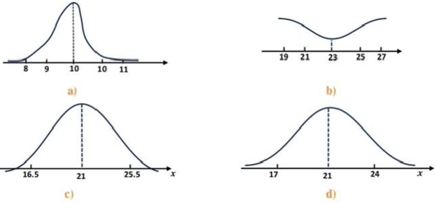
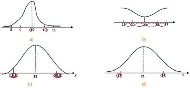
Which of the following curves represents a normal distribution?
I accept answer c, d .and may be a .
What is your opinion Dr math?
For comparison, here is what Wikipedia shows:
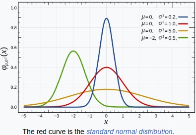
All of these are normal curves; they just differ in mean (which affects horizontal position) and standard deviation (which affects width and height). It’s worth noting, also, that the vertical scale is unrelated to the horizontal scale, so it would not be wrong to stretch or compress any of these. In particular, the graph is often drawn without a vertical scale, so you can’t tell what it is! So there’s a lot of freedom. But if you were a teacher, which answer(s) would you consider good enough to accept?
I answered:
Hi, Amia.
I would accept only (d).
(a) is clearly not symmetrical.
(b) does not approach zero (or have a finite area)
(c) goes below zero, so it is not even a distribution.
(d) looks accurate.
The point of the problem appears to be to test whether the student knows these properties of the normal distribution. Graphs (b) and (c) fail to represent probability distributions in the first place; (a) looks like a very rough attempt, but since symmetry is important, it is not acceptable. (I’ll have more to say below!)
Now, if these were not graphs given to the student to choose among, but graphs hand-drawn by a student, then I might be willing to accept (a) and (c) as good-faith attempts to draw what (d) shows. I often tell students, “your graphs are not judged on artistic merit,” and I see graphs like those (or worse) all the time. But in a multiple choice problem, it is clear that they are intentionally drawn wrong in order to draw attention to their errors.
I commonly see students draw something like this:
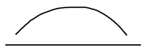
It’s symmetrical and decreasing at the ends, so when the goal is just to represent a problem, I don’t complain about it. If a teacher used a graph like that, I would be unhappy with it! My usual quick sketch is something like this:
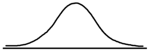
As we’ll see below, that’s pretty accurate.
My answer might also be different if the question were not, “Which of the following curves represents a normal distribution?” but “Which of the following curves represents an approximately normal distribution?”
To my mind, “represents” means it should be reasonably accurate. But I suppose even a child’s stick figure of a man “represents” a man, so you may disagree!
Recall what the graphs looked like:
Furthermore, when I look beyond the general shape, I see additional issues that may or may not be intentional:
(a) has an invalid horizontal axis, with two points labeled 10.
(b) has a horizontal axis in which evenly spaced numbers (differing by 2) are not separated by equal distances.
(d) for some reason has the numbers 17 and 24, which differ from 21 by 4 and 3 respectively; there is nothing actually wrong with this, unless it is inferred that these are meant to be, say, z = -1 and z = 1.
(c), though nothing is technically wrong with its axes, has two points besides the mean marked for no clear reason, as they do not correspond to any commonly used values of z; again, if there is a tradition of marking such points for some reason, that could imply an error.
But, again, I would probably not reject a hand-drawn graph for these trivial reasons, but would comment on them.
In actual use, the numbers in (c) and (d) might represent numbers needed for a particular problem (e.g., bounds on the value of x). So there is really nothing wrong with (d), except that the distance from 21 to 24 doesn’t look quite like 3/4 of the distance from 17 to 21.
Estimating the standard deviation from a graph
Now we move to the question from this May:
Hi Dr Math,
I have the problem below and its answer:
[Google translation: Each of the two adjacent curves represents a normal distribution. Compare these two distributions in terms of their mean and standard deviation.]
Answer:
[Google translation: Distribution A is less dispersed and narrows in its middle, while the middle of distribution B widens, so it becomes σA < σB.]
How can I know the values of the standard deviations from the graph?
Thank you in advance.
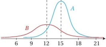


It is easy to see that the means are 15 and 12, respectively. But can we estimate the standard deviations accurately enough to answer the question? The solution method shown is qualitative, yet the answer includes actual numbers, so I take Amia’s question to be about determining those numbers.
I answered:
Hi, Amia.
That’s an interesting question. I don’t think I’ve seen a textbook ask students to determine the sd from a graph, and I would expect the author to have told you what to do before asking it.
I see two ways to answer it. One is to guess based on experience. I’ve seen enough graphs like this,
so that I tend to draw lines at z =–3, 2, -1, 0, 1, 2, 3 in approximately the right places by looking; so from your graphs, I would see this:
So I’d guess that the sd of A is about 1.5 (since my line is at about 16.5), and, similarly, that the sd of B is about 2.5 (since my line is at about 14.5).
That disagrees with the given answers; but it is just a guess.
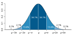
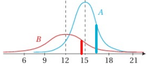
I drew in lines that looked like about \(\mu+\sigma\), the first line to the right of the middle in the familiar graph; and then estimated how far they are from the mean; that is the standard deviation.
For more precision, we can use the actual equation of the normal curve (which is seldom mentioned in introductory courses):
$$f(x)=\frac{1}{\sqrt{2\pi\sigma^2}}\exp\left(-\frac{(x-\mu)^2}{2\sigma^2}\right)$$
We can use this to make more precise my visual approximation. Observe that
f(x) = 1/√(2πσ2)e^(-(x-μ)2/(2σ2))
f(μ) = 1/√(2πσ2)e^0 = 1/√(2πσ2)
f(μ+σ) = 1/√(2πσ2)e^(-σ2/(2σ2)) = 1/√(2πσ2)e^(-1/2)
so that
f(μ+σ)/f(μ) = e^(-1/2) = 0.6065
So one standard deviation above or below the mean is where the curve is about 60% of its peak. I didn’t have that particular number in mind when I did my estimate, but just compared visually.
In other words, I knew what it looks like, just from experience, without thinking about numbers.
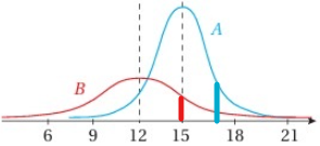
Now, if we work backward from your given answers, that σ = 2 and 3 respectively, we see that they are using these points (at x = 15+2 = 17 and 12+3 = 15 respectively:
Both points look too low; so I’m not sure their graphs were made accurately using the parameters they claim.
In fact, I can graph these two normal curves ((15, 2) and (12, 3) respectively), and overlay that on the given graph (after stretching vertically to make the scale match):
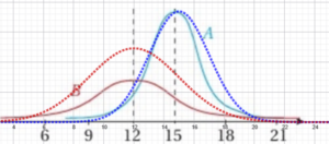
We can see that the horizontal scale is not quite uniform; the height of B is smaller than it should be; and A has too small a standard deviation, as we’ve seen. Somehow, they failed to use precise graphs, even though the shape is largely correct.
If we adjust the height of B to match what they drew, we see that the shape is still a little off:
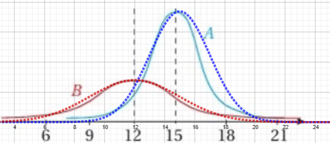
So they can’t expect too much of us! But did they? I hadn’t looked at the Arabic in the problem and solution until now:
I see that Google translates the problem statement as “Each of the two adjacent curves represents a normal distribution. Compare these two distributions in terms of the values of the arithmetic mean and the standard deviation.” This does not explicitly ask for exact values, and the answer (though claiming, if we read it literally, to give exact values) seems to focus on the comparison:
A: μ = 15, σ = 2
B: μ = 12, σ = 3
Distribution A is less dispersed and narrows in its center, while the center of Distribution B expands, so it is σA < σB.
I would give the same answer, though I’d have written this:
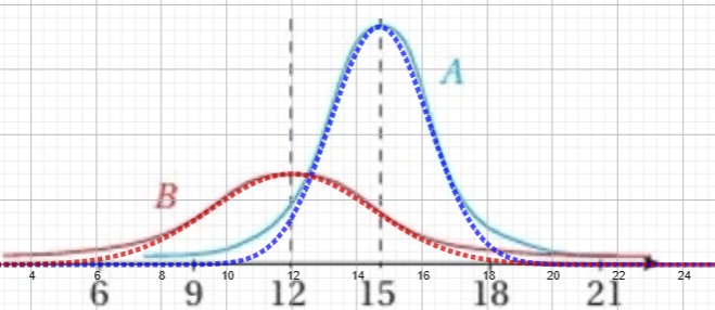
A: μ ≈ 15, σ ≈ 1.5
B: μ ≈ 12, σ ≈ 2.5
Here is what it looks like with those numbers (with 15 changed to 14.7 to match the horizontal scale):
Amia replied with a suggestion in the form of a question:
Is the inflection point of the normal curve occur in m+s 1 standard deviation?
I answered:
I hadn’t thought about that, but, yes, the inflection points are at μ±σ:
https://en.wikipedia.org/wiki/Normal_distribution#Symmetries_and_derivatives
That shouldn’t be hard to show by differentiating.
So if you are sure that a normal curve has been drawn accurately, you could roughly estimate the sd that way.
Of course, I see students all the time making very inaccurate sketches of the curve, and even teachers may do that.
Here is what I might have drawn using the inflection points of the original image:
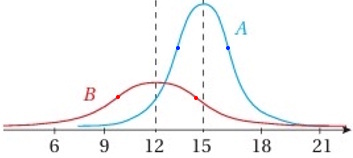
I’d give essentially the same answers I gave without this idea.
In my opinion, though, inflection points are a little harder to judge than heights, which is probably why I didn’t consider it; but in later exploration I found that some sources do emphasize this detail of the shape, such as this site (which I’ve often referred students to):
MathBitsNotebook: Normal Distribution
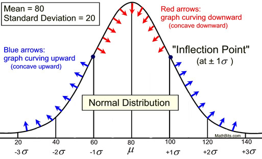
When I compare this to the correct graph, I find that it is, in fact, correct (when I move the horizontal axis up a little to match the asymptote).
But as I think about it, I probably just don’t assume that graphs I see are accurate to the degree that I could trust the inflection point!
Some sites that make no claim to be teaching the topic carefully, but also some that do, can be quite wrong.
For example, one might expect this to be more or less accurate, but the inflection points are clearly wrong, and the labelling is probably not intended to be accurate:
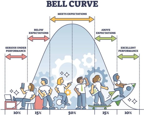
Note also that this graph goes down to exactly zero, rather than asymptotically.
To show that our impression is correct, here I’ve overlaid an accurate curve and inflection points:
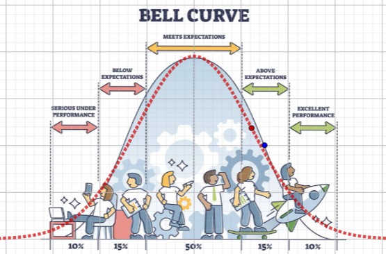
Other graphs on the site are accurate, while one, clearly meant to look like a rough sketch, is worse. Does it matter? Not really. But this is why one’s intuition might be a little off.
There are a wide variety of images at places like Shutterstock that vary tremendously in quality, but that’s to be expected.
By the way, did you think answer (d) in the first problem above was fairly accurate? Here’s a comparison to the best fit I was able to attain:
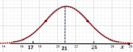
The curve is just about perfect; but, as I’d observed, the labeling of the horizontal axis is a little off. The point labeled 21 lies to the left of the peak, and 17 is to the right of the actual 17. The red curve has \(\mu=21,\sigma=2.3\).
Pingback: What is a z-Score, and Why? – The Math Doctors