
(A new question of the week)
Having just discussed several mathematical topics that lie behind the various graphs we have seen in the news lately, I want to depart from our usual style and answer my own current questions. We’ll look at several graphs of COVID-19’s growth and think about what we can learn from them. As always, I am talking about the math, and using some examples from a rapidly changing collection of information, so nothing I say should be taken as a prediction of the future or as an authoritative interpretation of the data. I am not an epidemiologist, just an observer.
Why it’s important to look closely
A graph (or, really, any sort of data) needs some explanations: What variable is on each axis? What is the scale? What dataset is represented (e.g. the world, or one country)? This will determine its meaning. Sometimes when we just glance at a graph, we can come to wrong conclusions because we are subconsciously thinking of it as something it isn’t, or expecting something other than what it is.
When I first started looking at these graphs, I kept misinterpreting them, and being surprised when I noticed a detail I’d missed. I’d confuse a graph of active cases with a graph of new cases, which is similar but not quite the same. I’d see two graphs on different sites that ought to look the same (I’d think), but then I’d realize there was a reason they were different.
My goal here is not to be a detective discovering important facts about coronavirus hidden in these graphs, but just to help people practice the care needed in looking at data, to avoid drawing wrong conclusions.
Cumulative total cases
The first graphs I paid attention to were probably the graphs of total cases and total deaths. Let’s start with various graphs on this page from Johns Hopkins University. The graphs I’m using here were accessed April 13, and are very nicely explained.
The page starts with this summary of the purpose of these graphs:
Seeing the total number of cases over time, on a country-by-country basis, can illustrate how the pandemic is expanding. These charts show cumulative cases – for instance, the number of people who have ever tested positive for coronavirus in a given country, regardless of whether they have recovered. An upward bend in a curve can indicate either a time of explosive growth of coronavirus cases in a given country or a change in how cases are defined or counted.
The most important thing to be aware of in this kind of graph is that it will never go down! “Cumulative” means that we just pile up cases, one after another, and never take any off. This is not a graph of the number of current cases, even though initially they might look similar. What matters here is how it increases, not whether.
By date
Let’s first look at the second graph on the page, which shows the history of the pandemic, by date:
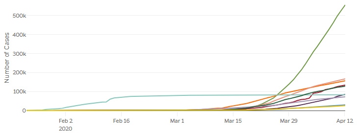
I’ve previously shown this kind of graph for the world (excluding China). Here we are comparing the number of cases in the top ten countries. We see on the vertical axis that it shows the number of cases; but the header I didn’t clip is more complete: “Cumulative Cases By Date”, making it clear that this is not current cases, but cumulative. Always look both at the axis labels and the graph description!
What stands out here? Probably the huge curve for the US (green), and the long horizontal line for China (aqua). Each of these reflects a special property of that country: The US is large, so it will naturally have more people than others even if a relative few were affected; and China got an early start, so it has a long history. The fact that China’s curve is so flat implies that they stopped the epidemic from spreading throughout the country; whether that is true, and how, is for others to discuss.
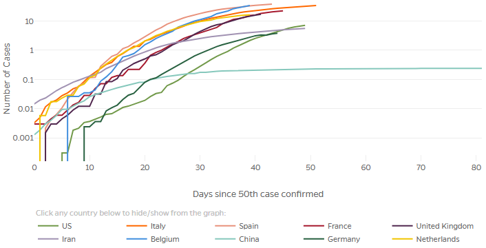
By elapsed time
We can remove the effect of different start times in different countries by shifting each graph to a common relative starting point; that is the purpose of the first graph on the page, whose horizontal axis is measured not by actual dates, but by days since the 25th case in that country. (If they started with the first case, there would probably be more variation in how long it took for the virus to get established. Other sites start at the 25th or the 100th.)
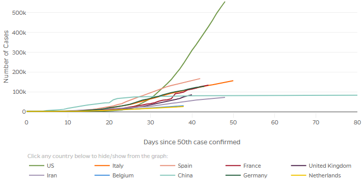
These are the same graphs as above, but with horizontal shifts. This lets us compare how fast each grew, rather than when. This is valuable when our goal is to compare what happened in different countries, rather than to see the history of transmission.
Relative (per capita) numbers
To make this comparison even more appropriate, we can eliminate the effect of the size of a country by making our vertical axis relative. A button on the graph above gives us the option of looking at “confirmed cases per 100k population“:
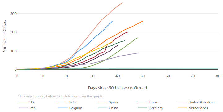
Now the US is near the bottom of the pack, rather than the top. For consistency with the vertical scale, we could compare better by starting when a certain fraction of the population was infected, which would move the graphs for larger countries further to the left. We always need to be aware of reasons why our first impression might be wrong, and look for ways to eliminate such biases. The site may well change this eventually, as many graphs have already been improved since I’ve been watching them.
The important thing here is that we can see all the graphs more clearly because smaller countries aren’t buried in the dust. What can we say about their shapes? The main thing I see now is that although all the graphs look initially exponential (always curving upward), a couple (Spain and Germany, and maybe Italy) are actually starting to curve more toward the level (not literally going down, of course, but curving downward like the logistic curve we explored). Others (notably the US and Belgium) have at least straightened out, becoming something close to linear.
Linear and logarithmic graphs
But it’s hard to visually distinguish exponential growth from linear, or something in between. This is why (as we saw in the post on exponential growth, and again on logarithmic graphing) many sites with graphs include a “logarithmic” button.
Let’s click that button on the last graph above, “Confirmed cases per 100k population”:
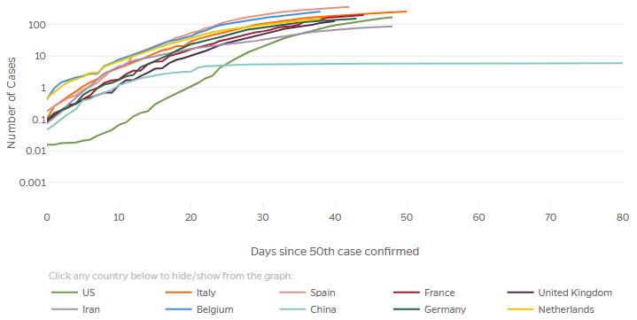
Remember that “number of cases” now means per 100,000; that’s why it can go below 1! This both compresses the high numbers, and stretches out the small numbers that can’t be distinguished in the linear graph. We can see more clearly now that if instead of the 50th case, we started with one millionth of the population in each country, the US graph would be shifted left by about 11 days, while some (Belgium and the Netherlands) would be shifted to the right!
But the main thing we see here is that all the graphs eventually curve below a straight line, so none of them are still exponential – they are all decreasing in the rate of spread, which is good. But how good?
Cases vs deaths
One more issue in looking at a graph is the reliability of the data. So far, I have always shown numbers of cases rather than deaths, largely just for consistency, but also because I have wanted to talk about the spread of a virus, not about its effects, which may vary from time to time and from place to place according to differences in culture, geography, or infrastructure. But at the same time I’m aware that it’s hard to be sure every country is counting cases in the same way, especially due to problems in testing. Johns Hopkins makes this comment:
Increases in deaths may happen two or more weeks after the corresponding increase in cases, but the number of deaths may be more reliable than confirmed cases because deaths are more likely to be accurately reported.
So looking at deaths rather than cases introduces a delay (making it less effective in showing effects of current actions), in addition to the deficiencies I mentioned; yet it is perhaps more accurate … unless you consider deaths at home whose cause was not reported or even known. The fact is that no statistic can really be trusted at this point.
Let’s look at deaths per 100k, for comparison with the previous graph:
One oddity here is the jaggedness of the lower parts; this is because the number of cases per 100,000 population is so small at the outset that adding 1 person makes a sizable change in the logarithm. For example, the vertical start to the dark green line (Germany) represents an increase from 0 to 2 people. (Two out of a population of 83 million is 0.002 per 100,000, which is just what we see on the graph.) Adding 1 from there makes the graph step up visibly to 0.003.
But the basic shapes are similar to those on the previous graph, though shifted to the right.
Doubling times
We’d like to quantify the rate of growth, rather than having to compare by eye the slopes of various curves. Let’s look at another page, this one from the New York Times. First, a logarithmic graph of deaths (absolute, numbers):
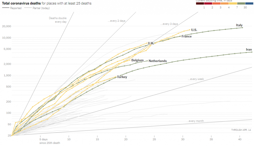
You really have to go to the site to experience this interactive graph. There are many curves that appear when you hover over them. Observe that the vertical axis has more markings than those we’ve seen, representing a typical semi-log grid; and notice the lines radiating from the lower left showing how fast the numbers double, which I discussed last time. If we select a particular country, it also shows a line representing the average slope over the last week:
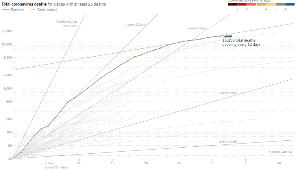
As we’ve seen, a straight line on a semi-log grid represents exponential growth, with a constant doubling time, in this case every 12 days. This still appears exponential, but a much better exponential growth than it was before. Readers not familiar with semi-log graphs will likely misinterpret this graph, thinking the growth is slower than it is; but it clearly shows what is changing.
Growth rate
The same New York Times page then directly shows the growth rate of the total number of deaths. What this means is the new deaths per day, as a percent of the total number of deaths. So if the total doubled each day (there were as many deaths today as on all previous days), the rate would be 100%. To be more precise, they have averaged the death rate over a week.
As the page explains:
Another way of looking at the same information is to plot the growth rates directly. With epidemics, these rates are often more important than the current totals. A reading of 40 percent on the chart below means that, on average, the number of deaths has been increasing by 40 percent each day. A reading of 100 percent would mean that cases were doubling daily.
Here is the graph:
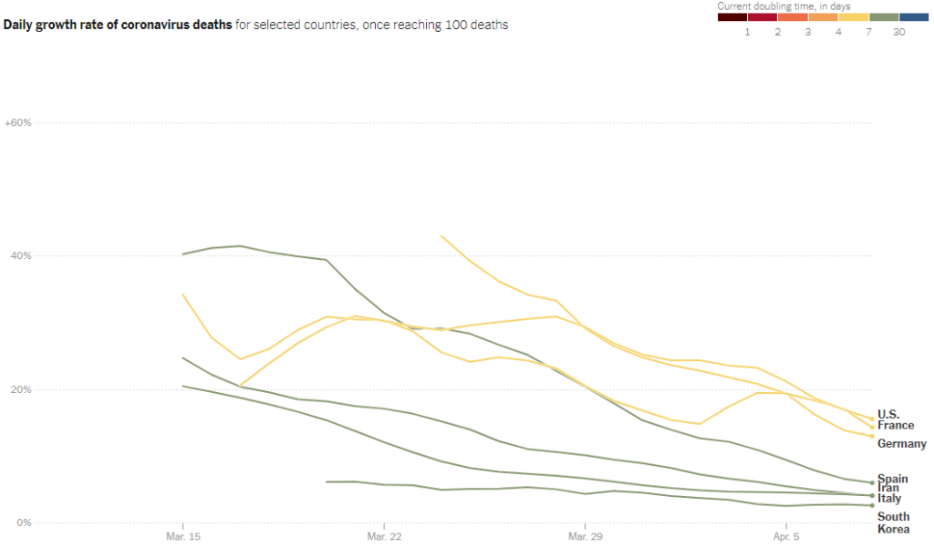
How is this death rate related to doubling time? Given a relative growth rate R “(deaths/day)/death” or simply R/day, the number after n days has been multiplied by \((1+R)^n\); setting this to 2 and solving for n, the doubling time is \(\displaystyle n = \frac{\ln(2)}{\ln(1+R)}\). Taking their example, for R = 100% = 1, \(\displaystyle n = \frac{\ln(2)}{\ln(1+1)} = \frac{\ln(2)}{\ln(2)} = 1\) day. A rate of 20% on this graph means a doubling time of \(\displaystyle n = \frac{\ln(2)}{\ln(1.2)} = 3.8\) days.
Daily new cases
Another way to think about the rate of growth is the number of new cases (or deaths) on each day. This will typically fluctuate randomly, so just as in doubling time or growth rates above, it is useful to smooth the data by averaging over several days.
We’ll look at this page from Johns Hopkins (accessed April 14), which begins with this explanation:
Has the curve flattened?
Countries around the world are working to “flatten the curve” of the coronavirus pandemic. Flattening the curve involves reducing the number of new COVID-19 cases from one day to the next. This helps prevent healthcare systems from becoming overwhelmed. When a country has fewer new COVID-19 cases emerging today than it did on a previous day, that’s a sign that the country is flattening the curve.
On a trend line of total cases, a flattened curve looks how it sounds: flat. On the charts on this page, which show new cases per day, a flattened curve will show a downward trend in the number of daily new cases.
Here is their first graph:
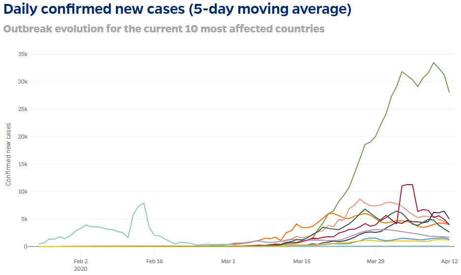
There is one encouraging thing to see here: almost all these curves are in fact turning downward. Looking closely, we see that the vertical axis shows (linearly) new cases for each day, identified by date.
Moving averages
But the heading calls this a “5-day moving average”. What does that mean? They helpfully tell us exactly:
This analysis uses a 5-day moving average to visualize the number of new COVID-19 cases and calculate the rate of change. This is calculated for each day by averaging the values of that day, the two days before, and the two next days. This approach helps prevent major events (such as a change in reporting methods) from skewing the data. The interactive charts below show the daily number of new cases for the 10 most affected countries.
They look ahead and behind, not meaning that they tell us today what the next two days will be (!) but that the date they assign to each average is the date in the middle of those five days, because that is taken as representing the number on that day.
We can see this better in the individual graphs that follow; since we looked at Spain above, let’s use that one as an example:
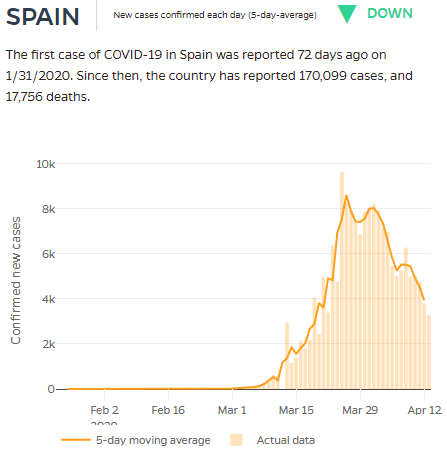
You can see the actual number of new cases reported each day (the vertical bar), and the moving average (the dark line connecting a point for each day). Notice one day shortly before Mar 15 when no cases were reported; there were twice as many as normal on the next day, suggesting that possibly two days were reported as one (because they forgot to report the first day?). That is what the moving average is meant to correct for.
The result is what looks like a relatively smooth curve. The overall shape, ignoring the little ups and downs, is the sort of “heap” I showed in a theoretical graph in the post on the logistic curve, representing the rate of change (derivative) of the logistic function. Here, we have real-life, with discrete amounts on discrete days, not the continuous function of theory; but we can see the connection.
Active cases
We say that this “new cases per day” curve is what we want to flatten; but in my mind that is really a proxy for what we really want to flatten: the number of active cases, or more exactly the number of acute cases in hospitals, on any given day. Some sites have been reporting that, but it is rarer. (See worldometers.) This is also the heaped curve I showed from the SIP model.
Mortality rates
Let’s look at one more pair of graphs that I find fascinating, though it is very different from our others. It is found here at the Johns Hopkins site.
First, they show the Case Fatality Ratio, the number of deaths per confirmed case. This is not necessarily accurate because not all cases are confirmed, and not all deaths have a known cause; but it is worth thinking about, and the manner of presentation is unique:
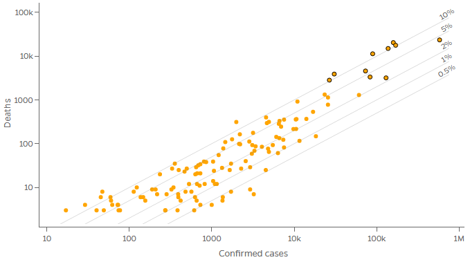
The dot at the far right, with the most cases in the world, is the US; the cluster to its left are Spain, Italy, and France, with fewer cases but similar numbers of deaths, resulting in a higher mortality rate.
Observe that this is a log-log graph, the first one we’ve seen. Let’s check that the mortality rate will be constant along parallel lines as shown:
Let c be the number of confirmed cases, and d the number of deaths. The mortality rate will be \(r = \frac{d}{c}\), so \(d = rc\). Suppose r is constant. As we saw in a previous post, any power law \(y = ax^b\) will graph as a straight line on a log-log graph; our relationship is a power law with exponent 1! In particular, taking the log of both sides, \(\log(d) = \log(r) + \log(c)\). If we call the physical distances on the graph C and D, the equation of one of these lines is \(D = C + \log(r)\). So the slope is 1 (it doesn’t look it because the scales differ), and the D-intercept is \(\log(r)\). Our lines, which (mostly) represent rates differing by a factor of 2, are equally spaced by the log of 2.
By clicking a button, we can display the proportion of the total population that die from the disease; this of course will change as the virus spreads through a given population, but is still instructive:
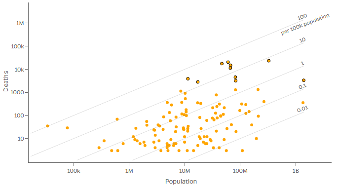
Again, parallel lines indicate different ratios. The farthest right of the black-bordered dots represents China (which, with India, has the largest population); the next is the US, with a larger population than those to its left, but a lower rate (for now).
There are probably many great sources for graphs out there; I apologize to readers who are not from America for my unavoidable bias toward American sources and information about America (though I’ve tried to minimize that).
One more page I want to mention includes some interesting graphs, but the most interesting parts are its maps, a topic I can’t get into here. It’s another page from the New York Times. The map of doubling time by country (“Where cases are rising fastest”) and the accompanying table showing all the main data together with bars revealing how growth rates have changed (sortable by any column) are particularly useful. A similarly useful set of bar graphs are found here, at information is beautiful. This will undoubtably change greatly in coming weeks and months, and hopefully remain when this has all ended.