We’ve been looking at the math underlying some of the graphs associated with the COVID-19 pandemic, starting with exponential growth, and then logistic growth. I want to look in more detail at a feature I mentioned in the first post, viewing a graph logarithmically. This is a powerful technique that goes far beyond a button on a graph.
Semi-log and log-log graphs
Here is a question from 2002 to introduce the concept:
Logarithmic Scales

In my profession (environmental science) I often see data presented on a logarithmic scale. For instance, a particular toxicant concentration (i.e., independent variable) plotted against against a specific biological response to an organism (i.e., dependent variable) is often plotted on a log-log scale. Please explain to me why empirical scientific data might be transformed to logarithmic data and presented on a logarithmic scale.

I have asked scientists in my agency to explain this to me and have never quite understood their answers. I have reviewed several archived questions from the Dr. Math site regarding logarithms, but still do not really understand the practice of plotting data on a log-log scale.
I was the first to answer:
Hi, Brian.

Looking in our archives, I found this one example of the use of log-log, which may be interesting to you:

   Finding a Formula That Fits the Data
   http://mathforum.org/dr.math/problems/mullen.1.26.00.html
This is a complicated and inconclusive example that I will not be exploring in this post. We needed a better introduction.
On the Web, I located this PDF file of a nice paper on the topic:

   Equations of Straight Lines on Various Graph Papers
    This document describes step-by-step how to determine the
    equations of straight lines plotted on linear, semi-log, and
    log-log graph paper. Includes diagrams and examples.

   http://www.humboldt.edu/~geodept/geology531/531_handouts/
        equations_of_graphs.pdf
This page still exists, and does provide a good, detailed summary of how to use this kind of graph.
Semi-log graphs
I'll give a quick explanation.

First, let's look at a semi-log graph. Here, the horizontal axis represents x as usual, but the vertical position is not y units from the axis but log(y), which I'll call Y to make notation easier. (You can use any base you want for the log, but I'll assume base ten.) If you draw a straight line on this graph, then it has an equation of the form

    Y = ax + b

which means

    log(y) = ax + b
Graph paper is commonly made for this purpose based on 10, which makes it easy to label. Here is an example, where as you see I have a logarithmic scale in the vertical direction but a linear scale horizontally:
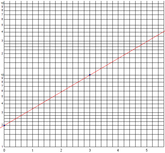
The way to read the vertical scale is to assume a meaning of the 1 at the bottom, and observe that the numbers rise to 10. The next cycle of lines will cover the range from 10 to 100; that is, we imagine an extra zero on these labels, which would be written in if this weren’t a general-purpose grid that is not committed to a specific meaning. (The same grid could cover values from, say, 0.1 to 10, rather than 1 to 100.) Where the red line crosses the right side of the graph reads as a little more than 40.
The y-intercept here is at \(y = 2\), so the actual vertical distance is \(Y = \log(2)\); the point is \((0,\log(2)\). The other dot is at \((3,\log(10)\). So the slope is $$m = \frac{\log(10)-\log(2)}{3 – 0} = \frac{\log(5)}{3}$$ and our line has equation $$Y = \frac{\log(5)}{3}x + 2$$ This means $$\log(y) = \frac{\log(5)}{3}x + 2$$
Now, if you raise 10 to the power on each side of this equation, you get

    y = 10^(ax + b)

      = 10^(ax) * 10^b

      = k 10^(ax)

where k = 10^b. So if you expect two variables to have an exponential relationship, you just have to plot them on semi-log paper, find the best-fit line, and use its slope and intercept to find the parameters for the equation.
Our equation becomes $$y = 10^{\frac{\log(5)}{3}x + 2} = 2\cdot 5^\frac{x}{3}$$
To check, for \(x = 5.6\) at the right-hand side, \(y = 2\cdot 5^\frac{5.6}{3} = 40.34\). That’s about right.
So on a semi-log graph, an exponential function \(y = k\cdot 10^{ax}\), or \(y = k\cdot c^x\),will look like a straight line, and we can determine its parameters by measuring the slope and intercept as we just did.
If we had put the log scale horizontally, a line would represent a logarithmic function.
Log-log graphs
The same sort of thing happens with a log-log graph. Here the horizontal position is X = log(x) and the vertical position is Y = log(y), so a straight line represents

    Y = aX + b

    log(y) = a log(x) + b
Here is an example:
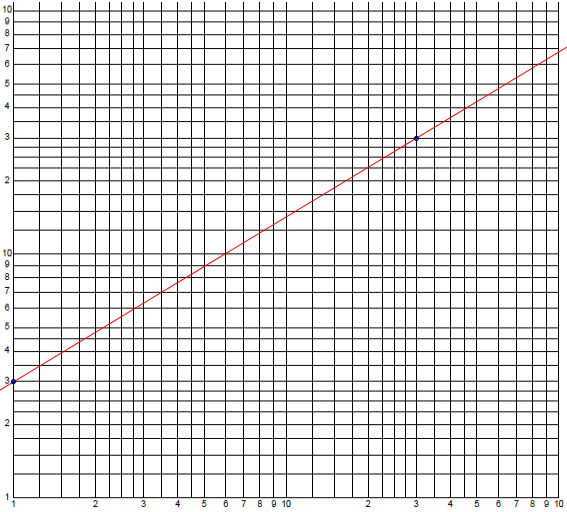
The y-intercept here is at \(x = 1\) and \(y = 3\), so the actual horizontal and vertical distances are \(X = \log(1) = 0\) and \(Y = \log(3)\); the point is \((0,\log(3))\). The other point is at \(x = 30\) and \(y = 30\), i.e. \((\log(30),\log(30))\); note that these are both in the second cycle, so they are not just 3. So the slope is $$m = \frac{\log(30)-\log(3)}{\log(30) – 0} = \frac{\log(10)}{\log(30)} = \frac{1}{\log(30)}$$ and our line has equation $$Y = \frac{1}{\log(30)}X + \log(3)$$ This means $$\log(y) = \frac{1}{\log(30)}\log(x) + \log(3)$$
Raising 10 to each power again, we get

    y = 10^(a log(x) * 10^b

      = 10^b (10^log(x))^a

      = k x^a

where k = 10^b. So if x and y are related by a power law of this form, you can find the parameters by looking at the slope and intercept.
Our equation becomes $$y = 10^{\frac{1}{\log(30)}\log(x) + \log(3)} = 3x^\frac{1}{\log(30)}$$
To check, for \(x = 100\) at the right-hand side, \(y = 3\cdot 100^\frac{1}{\log(30)} = 67.78\). That’s about what we see on the graph.
So on a log-log graph, any power function \(y = k x^a\) will look like a straight line, and again we can determine its parameters by measuring the slope and intercept as before.
Look at the situations in which each kind of graph is used, and compare it to the equations involved, and you should see exponential and power laws.
… as we did.
Why are they common in science?
A couple minutes later, Doctor Schwa wrote about the other side of the question:
Plotting on a log-log scale has many advantages for environmental science.

1) You are often dealing with very big or very small numbers, and particularly you are often dealing with numbers that range over many orders of magnitude.

For instance, if you are measuring concentrations of some pollutant, and your data are something like 0.01 ppb, 0.2 ppb, 2ppb, 117 ppb, if you plot it on a linear scale, then the three smaller data points will all be "squished" in at almost the origin while the one big point sticks way out. You won't be able to see your data at all.
This is also why, for example, we use pH or the Richter scale, both of which use logarithms to compress the range of possible numbers.
2) Power laws are very common.

If you plot any power law (y = a * x^b) on a log-log scale, you get a straight line whose slope is b. So it's always good to plot power law relationships on log-log axes, so you can see how closely they fit to a straight line.

On standard axes, power law and exponential relations often look very similar. On log-log axes, the power law looks very much like a straight line while the exponential relation does not (to make the exponential linear, you'll have to take the log of only the y axis).
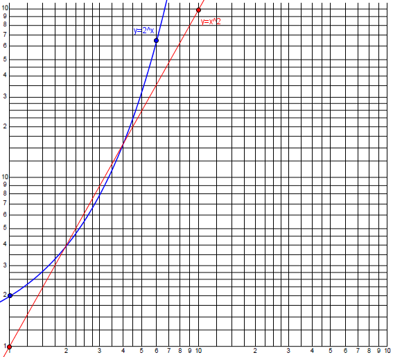
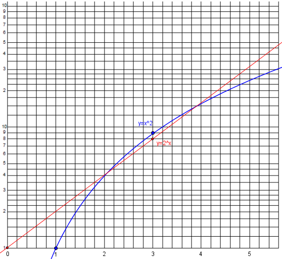
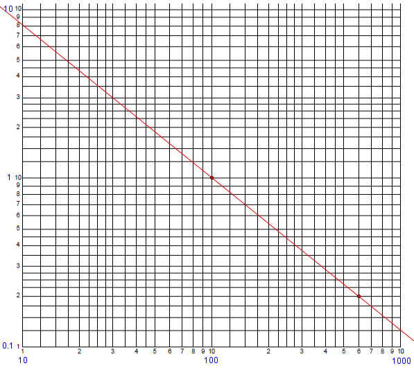
This is what we did above. In the recent discussion of exponential growth, we saw what a power law (the quadratic \(y = x^2\)) looked like next to an exponential law (\(y = 2^x\)) on a linear graph. Here is what they look like on a log-log scale (red is a power law and becomes a line, blue is exponential, and still looks exponential):
If the biological response, in your example, is related to some power of the toxicant concentration, you'll get a nice straight line. If it's another function (logistic, or exponential) those shapes are also often easier to recognize on log-log scales (but not so easy to describe in words).
Here are the same two functions on a semi-log scale (red is exponential and becomes a line, blue is a power law and becomes a logarithm):
3) Often, percent change is what is important.

On standard axes, an equal QUANTITY of change is an equal amount of space. On log axes, an equal PERCENT change is an equal amount of space. You can thus use your eyes to quickly compare percent growth or percent change, instead of having to correct for the magnitude of the data.

That is, 10 and 12 will be equally far apart as 50 and 60 on log axes, because each is a 20% increase.
Brian replied:
Dr. Schwa:
Thank you very much for your excellent response to my question. I see now that there are several good reasons why so much of the scientific data I see is presented on a log scale. Your explanation was very helpful to me and is much appreciated! Thanks again.

Dr. Peterson:
Thank you for your response and the additional sources you have provided to help me understand the reasons for presenting scientific data on logarithmic graphs. This information has been very helpful and I do appreciate your time and knowledge. Thanks again!
Example: Finding an equation from a log-log graph
For a specific example of the use of such a graph, consider this 2006 question:
Equation of Straight Line on the Log-Log Scale

I have a log-log graph with a straight line on it, and I want to find the line's equation.  The x-axis is scaled as 0.01, 0.1, 1, 10, 100 and the y-axis is 10, 100, 1000, 10000.

I am using two points on the given line, (100,1) and (600,0.2) and finding the slope m = -1 and the y-intercept b = 101 so my equation is y = -1x + 101.

But none of the points on the given line check when I put them in that equation except (100,1), so that can't be the right equation.  What am I doing wrong?
Here is part of the graph containing the specified points (with the actual values on the scale added in blue):
I answered:
A straight line on the log-log scale is not given by

  y = mx + b

but by

  log(y) = m log(x) + b

since the actual locations on the graph are the logs of the coordinates x and y.
That is, we have to take the logs of the indicated coordinates to find the physical coordinates of points in the graph.
This in turn means the same as

  y = 10^b x^m

(by raising 10 to the power on each side).
The “y-intercept” of the graph (which, by the way, is the value of \(\log(y)\) when x = 1) gives us the coefficient, and the slope is the exponent in this power function.
There are a couple ways to find the equation. One is to directly use the power function form:
So in order to find the parameters of this equation, which I'll simplify to

  y = c x^m

you want to plug x and y for two points into either form of the equation and solve for the parameters.  In this case, you can solve

  1 = c 100^m
  0.2 = c 600^m

You might start by dividing one equation by the other to eliminate c, and then take a log.
Here we are using the fact that any straight line has an equation of this form, and just putting known values into the standard equation. Now we solve this non-linear system of equations for the unknown parameters, which can be done easily by dividing the second equation by the first to obtain $$\frac{0.2}{1} = \frac{600^m}{100^m}\;\Rightarrow\;0.2 = 6^m\;\Rightarrow\;m = \log_6(0.2) = -0.8982$$
Then we find that $$c = \frac{1}{100^m} = 100^{0.8982} = 62.588$$
Therefore, the equation is $$y = 62.588 x^{-0.8982}$$
Checking another point on the graph, when x = 10, \(y = 62.588 (10)^{-0.8982} = 7.911\), which looks about right.
Another method is to plug the points into the linear form:
Alternatively, you can solve

  log(1) = m log(100) + b
  log(0.2) = m log(600) + b

which might be more familiar.
Here we are working with the physical coordinates. In terms of decimal values, the equations are $$2m+b=0\\2.77815m+b=-0.69897$$
Subtracting the equations, \(0.77815m = -0.69897\), so \(m = -0.89825\), and \(b = -2(-0.89825) = 1.79649\). The equation is therefore \(y = 10^{1.79649} x^{-0.89825} = 62.588x^{-0.89825}\) as we found before.
Yet a third way is to observe that the physical coordinates of the two given points are \((\log(100),\log(1))\) and \((\log(600),\log(0.2))\), that is, \((2,0)\) and \((2.77815,-0.69897)\). The slope of the line is \(\displaystyle\frac{-0.69897-0}{2.77815-2} = -0.89825\); then use that in the point-slope form to get the same equation as above.
A logarithmic graph of COVID-19
We’ve already seen (in the post on exponential growth) how a semi-log graph can reveal how a curve is diverging from exponential. One of my favorite graphs, from information is beautiful, does that very clearly, as long as you read it carefully:
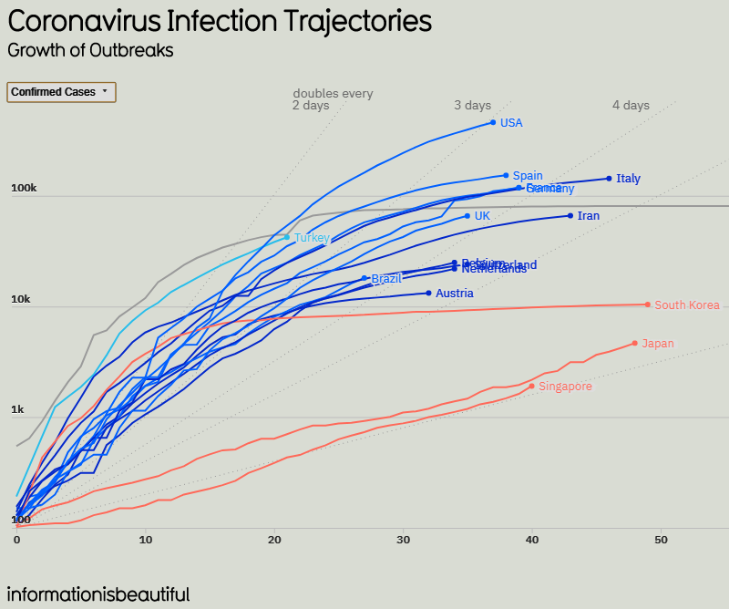
I’ve cropped it and changed colors to make it fit here better; it’s more “beautiful” in the source. The data here were valid as of April 10.Note that this graph shows the number of confirmed cases (meaning the cumulative total) in the top 16 countries (by total), in semi-log form, with actual numbers on the left, but each line 10 times the one below it to show the logarithmic scale. The numbers at the bottom are the number of days since the 100th case in each country, so that all the lines start at the lower left corner (except China, gray, for which data collection clearly started late).
What I like about the graph are the straight lines, not easy to see, labeled “doubles every 2 days … 3 days … 5 days … 10 days”. So a straight line represents pure exponential growth; the line a point is on indicates the average number of days to double, if the rate had been constant. For example, the end point for USA is on the line “doubles every 3 days”, so that exponential growth at that rate would have resulted in this value, about 500k at 37 days by my visual estimate. Let’s check: If it started at 100 and doubled every 3 days, then at 37 days it should be \(100\cdot 2^{37/3} = 516,000\). That’s about right.
We can see several kinds of curves here:
Slow exponential: The orange lines for Singapore and Japan, for instance, are virtually straight lines, implying that both have been essentially exponential with a nearly constant rate from the start; neither appears to have become logistic (that is, limited by population), but both have “flattened the curve” in the sense of maintaining a low rate from the start (doubling about every 9 or 10 days). They will eventually peak, but that peak will be lower than it would have been with a higher growth rate. We see no evidence, however, of when that peak may be, and if it continued exponentially it would eventually exceed the population of either country (or of the world!), so we know it can’t.
Logistic, past peak: The orange line for South Korea, and the gray line for China, curve downward more or less as we expect of logistic growth, having already reached linear growth so that the graph looks logarithmic, if not constant. The end point for South Korea, for example, appears to have doubled on average about every 7 or 8 days over the entire period, based on the final dot; but its current rate is indicated by the slope of the line approaching the end, which is nearly horizontal, so that it is not really exponential at all. (We looked at this last time, and saw that it has become linear, with a nearly constant number of new cases per day.)
Starting to slow: If we look now at the highest curve, for the USA, we see that it had been nearly straight, doubling only every 2 or so days, but then started curving downward. Its average now is as if it had been doubling every 3 days from the start; but its current slope is much better than that; to my eyes, it looks like it has been doubling every 7 to 10 days currently. The same is true of many other countries.
There is a lot to see in these graphs. Next time, we’ll take a final look at how to read the various graphs.