(New Question of the Week)
Occasionally we get questions challenging the correctness of a textbook problem, or of a test grade. And sometimes we get questions about mathematics used in sciences like physics or chemistry, which lead us to explore unfamiliar fields. The most interesting question this week is one of these. It is one where we first had to gather necessary information, and then two of us worked together to figure out what was going on. This is not something at which we are experts; but sometimes watching someone fumble around in an unfamiliar area can be instructive.
A curious graph
Here is the question, from Fida; I will be editing the whole discussion to save space:
I found this equation: \(k = A e^{\frac{-E_a}{RT}}\).
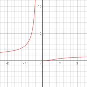
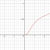
Why does the graph between k and T look like that? (See attached picture please) because \(k = c e^{\frac{-1}{T}}\) if we summarize the other variables as c.
And the graph does not look like that of \(y = c e^{\frac{-1}{x}}\).
Maybe I am missing something?
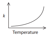
The picture was a rough sketch of an exponential function.
My initial question is, why does Fida think the graph is exponential? Is it his own idea, or did someone tell him that? Clearly the function does have a form similar to the exponential-reciprocal function he compared it to, whose graph, which I looked at in Desmos, looked nothing like the exponential.
We needed more information. I searched for the equation, and found that it is Arrhenius’ equation, used in chemistry. The first page I found with graphs, LibreTexts, had a graph that could match a small part of the exponential-reciprocal (though it had a logarithmic vertical scale), but looked nothing like the exponential. Here are the three graphs under consideration:
So I asked Fida for the source of the information: Where did you see such an exponential graph, and what units and numerical values were shown, so we could try to replicate it?
In response, Fida gave the URL of this chemistry test. Question 3 asks, “Which graph shows how the rate constant of a reaction, k, changes with temperature?”, and the supposedly correct graph is exponential, as shown at left above.
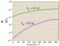
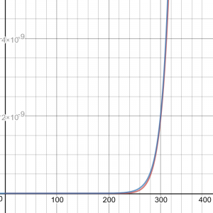
Now we have a context: a chemistry test is asking a qualitative question about variation of the rate constant with temperature, and answers it with a generic sketch with no indicated units (so we can’t tell whether temperature is in K or C, etc.). If they are right, then the graph they show must represent only a small part of the graph. In fact, if we ignore negative values of T (which is absolute temperature), and blow up the vertical scale, we see that this is reasonable:
An explanation
When x < 0.5, the graph looks similar to an exponential. I did a little more research and responded:
Clearly they are claiming that the rate k increases exponentially with temperature, and that you are expected to know this. So we want to figure out how this relates to the Arrhenius equation, which they evidently are not expecting you to think of. I’m not a chemist, but this intrigued me enough mathematically to look into it more deeply than I ordinarily might!
I looked at what Wikipedia says about the equation.
In the introduction, they say,
A historically useful generalization supported by Arrhenius’ equation is that, for many common chemical reactions at room temperature, the reaction rate doubles for every 10 degree Celsius increase in temperature.
This describes exponential growth, but is not obviously related to the equation. This rule of thumb must be what your test’s answer is based on – assuming that students have learned this, rather than the Arrhenius equation.
They show a graph that looks exponential, with the caption, “In almost all practical cases, Ea >> RT and k increases rapidly with T.” This tells us that the exponential growth is an approximation applicable at normal temperatures — presumably an approximation that could be derived from the equation over a limited domain.
Then they have another graph that looks like what you and I expect, with the caption, “Mathematically, at very high temperatures so that Ea << RT, k levels off and approaches A as a limit, but this case does not occur under practical conditions.”
So the approximation presumably applies in the part of the graph where it is concave upward. The article also mentions that the “constants” in the equation may actually depend on temperature, so it makes sense to consider only a small range of temperatures.
I find the same sort of information elsewhere, such as this site. At the bottom they say this, after going through a numerical example:
You can see that the fraction of the molecules able to react has almost doubled by increasing the temperature by 10°C. That causes the rate of reaction to almost double. This is the value in the rule-of-thumb often used in simple rate of reaction work.
Note: This approximation (about the rate of a reaction doubling for a 10 degree rise in temperature) only works for reactions with activation energies of about 50 kJ mol-1 fairly close to room temperature. If you can be bothered, use the equation to find out what happens if you increase the temperature from, say 1000 K to 1010 K. Work out the expression -(EA / RT) and then use the ex button on your calculator to finish the job.
The rate constant goes on increasing as the temperature goes up, but the rate of increase falls off quite rapidly at higher temperatures.
If you want to pursue this further (I would if I were you!), you might look into typical values for the variables and constants (as in that last page’s example) and make a graph such that you can zoom into the typical temperature region and see if it looks exponential, while zooming out shows the full shape of the graph. Then you might think about various approximation methods, to see if there is a way to demonstrate this mathematically. You may not be ready for that level of detail; it probably needs some more advanced calculus than you have seen.
So we have confirmation that this is an approximation that is valid only in a limited range of temperatures, which happen to be those most often encountered. The test expects students to have learned this rule of thumb, and not, like Fida, to think of Arrhenius’ equation itself, which leads to a very different answer (D rather than C). This is something I don’t like to see in tests: smarter students are penalized for knowing enough to be confused by a question.
Proof!
I didn’t have time to dig more deeply into the approximation, but Doctor Rick took up the challenge:
Hi, Fida. This problem puzzled and intrigued me, too; I spent some time looking into it myself, and Doctor Peterson’s last remarks gave me further ideas. Let me share a few of my thoughts.
First, when you reduce the Arrhenius equation \(k = A e^{\frac{-E_a}{RT}}\) to \(k = c e^{\frac{-1}{T}}\), that isn’t quite right; it can’t be reduced to a single-parameter family of curves. But if we define
y = k / A
x = RT / Ea
then we get \(y = e^{\frac{-1}{x}}\). Thus it’s a two-parameter family obtained from this parent function by scaling both the x and y axes.
Now, you can apply your calculus skills to that parent function; you’ll find that it is concave-up (and therefore more like the “correct” answer to your problem than any of the others) for x < 1/2. Above that, it’s concave-down, with an asymptote at y = 1. These are things I believe you should be able to do for yourself, but I’m supplying answers so you can check your work if you want to do it.
Now I have a suggestion as to how to do what Doctor Peterson suggested, seeing if we can confirm the rule of thumb (doubling of k for 10° increase in T). Take the natural log of both sides of the function above:
ln y = -1 / x
Now, you may have learned how to find a linear approximation to a function in the vicinity of a given point — find the slope of the curve at that point, and use the slope and the coordinates of the point to write the equation of the tangent line. Remember that we’re now taking ln y as the ordinate (you might want to change y above to, say, z, and let y = ln z).
Take Ea = 50,000 J/mol-° as suggested in the source Doctor Peterson quoted, and T0 = 300. Find the corresponding value of x, and use that to write the specific linear approximation about T0. You will find that the linear approximation for y = ln z approximates z (or k) as an exponential function of T. What is the doubling interval for that function? I get close to 10 degrees!
After a little more discussion, he filled in some of the details he “left for the reader”:
We don’t have the correct values yet, but let’s just say the equation is y = mx+ c. This y = ln z (where z = k / A). Thus,
ln z = mx + c
z = emx + c = ec emx
Do you see how we now have an exponential approximation to the Arrhenius equation, in the vicinity of T = 300°? That’s exactly what we were looking for. And from your knowledge of exponential functions, you can relate m to the change in T that will double k.
We managed to derive the approximation from the Arrhenius equation, showing that it is not a mere guess. I hope this also shows the value of approximations: for typical situations, the complete equation is complicated and misleading; the approximation is much more usable. Yet the approximation alone would be wrong, as it would imply very incorrect behavior for very large temperatures. This is often how math works in science.
That was quite a journey, from a seemingly simple question about a seemingly wrong graph, to some useful calculus!
Postscript
After writing this, I was curious about the details of the approximation – I wanted to do that zooming in I’d suggested. So I found the approximation near 300K, and graphed it along with the actual curve. Then I made additional approximations near 1000K and 2000K, and graphed them all. Here are the zoomed-in graph, then zoomed out:
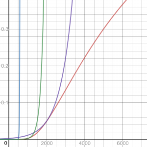
The red curve is the Arrhenius equation; blue is the exponential approximation near 300K, which looks good when zoomed in, but totally useless beyond 500K or so, and green and purple are the other approximations. It turns out that the approximation has nothing to do with the “exponential-like” appearance (concave up) of the curve we see in the exact graph; the approximation is just an exponential that happens to touch the curve at a particular place. It is a very rough rule of thumb, and not at all a representation of reality, which is not exponential at all! And yet, it has been found useful in the real world, where temperatures do not vary wildly.