(Archive Question of the Week)
We occasionally got questions about Probability Distribution Functions (PDFs) from students who lacked a full picture of what they are; when I searched for references to give them, I never found one that explained the whole concept as I wanted to. When the following question came in, I took it as an opportunity to create that reference. This week, a student asked some questions far above her current knowledge, that touched upon this topic; I referred her to this page, and took note that it might be one to add to the blog as well.
The normal curve, and other PDFs
Mike, in 2014, was looking at the subject from a fairly advanced perspective, knowing enough calculus to talk about it in detail; others, without calculus, write to us having been introduced to the normal distribution curve and the basic idea that “the area under the curve is the probability”, but not knowing anything more. I tried to aim my answer at a level that could help anyone.
PDFs Explained: From Histograms to Calculus

What are the output values of the probability density function (PDF)? And how does the integral of the PDF yield the probability?

I get confused thinking about the area as a probability. Look at the example of the odds of k heads for n flips of a fair coin. The output values are the corresponding probabilities, and inputs are k. I know that k goes to the z-score, but what about the probability outputs as n goes to infinity for the binomial distribution? Are they still thought of as probabilities? After all, the curve is approached as n tends to infinity. How is it that, when n tends to infinity, and the shape approaches the PDF, we can take the area to arrive at the probability?

I have looked at different explanations of the development of the PDF. To a certain extent, I understand its theoretical development: I understand that this is the continuous case of the binomial distribution, developed from setting up a differential equation with some basic assumptions; I know that DeMoivre derived the curve from Stirling's Approximation and some other mathematical trickery. However, this is not very enlightening, as it is the continuous case of binomial distribution.
Mike is primarily referring to the normal distribution, which many people see even without ever being taught what a PDF is in general. Here is a good introduction:
https://www.mathsisfun.com/data/standard-normal-distribution.html
He had gone beyond that, seeing deep explanations of the meaning of the normal distribution, such as this one:
Deriving the Normal From the Binomial
Start with a histogram
But it seemed that the underlying ideas were obscured by the detail; he wanted to see the basic concepts, such as what the vertical axis of a PDF even means, and how area comes to be involved. I chose to start with the basics of what a PDF is, to put it all in context. I started with a basic histogram, which is easy to understand.
The normal distribution can be derived from many different starting points; the limit of the binomial distribution is just one of them.
But I think your real question is about what a PDF means in the first place, and how it is related to histograms. In particular, what does the value of the PDF at a single point mean -- since it clearly is not the probability of that specific value, which would always be zero -- and why is it the AREA under the curve that gives a probability? Am I right about this?
When histograms are first introduced, we tend not to present them in the form that is directly related to the idea of a PDF. In their more advanced form, histograms are all about areas. So let's develop that idea, starting with the most basic concept and moving toward the PDF.
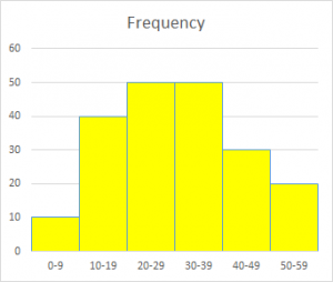
The most basic form of histogram is just a bar chart showing the frequency with which either discrete values, or values within "bins" or classes, occur. At this level, the bins are typically equal in width:
Freq |
50| +-----+-----+
| | | |
| | | |
40| +-----+ | |
| | | | |
| | | | |
30| | | | +-----+
| | | | | |
| | | | | |
20| | | | | +-----+
| | | | | | |
| | | | | | |
10+-----+ | | | | |
| | | | | | |
| | | | | | |
0+-----+-----+-----+-----+-----+-----+
0-9 10-19 20-29 30-39 40-49 50-59
In this case, the total number of outcomes is
10 + 40 + 50 + 50 + 30 + 20 = 200.
Here is a nicer version of the histogram:
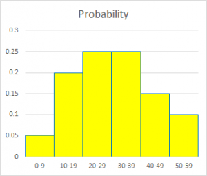
We can modify this to show the probability (relative frequency) of each bin, by dividing each frequency by the total of 200:


   Prob |
        |           +-----+-----+
        |           |     |     |
        |           |     |     |
     0.2|     +-----+     |     |
        |     |     |     |     |
        |     |     |     |     |
        |     |     |     |     +-----+
        |     |     |     |     |     |
        |     |     |     |     |     |
     0.1|     |     |     |     |     +-----+
        |     |     |     |     |     |     |
        |     |     |     |     |     |     |
        +-----+     |     |     |     |     |
        |     |     |     |     |     |     |
        |     |     |     |     |     |     |
       0+-----+-----+-----+-----+-----+-----+
          0-9  10-19 20-29 30-39 40-49 50-59

Now if you add up the probabilities of all bins, you get

   0.05 + 0.20 + 0.25 + 0.25 + 0.15 + 0.10 = 1.00

as we should. And if we think of the width of each bin as being 1, this would make the total area of the bars 1, since the area of a bar is its width times its height. Even if we don't literally say the width is 1, at least the area of each bar is PROPORTIONAL to the probability of each bin, which is what we visually expect: the biggest (not just tallest) bar should go with the most likely event.
Again, here is a more readable version:
Introducing probability density
At this point, we have a discrete probability distribution. But we need to give it a little twist before we can move to the continuous case:
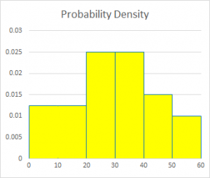
But sometimes you need to use bins of different widths. This is discussed at length here:

  Modal Class of a Histogram with Unequal Class Widths
  http://mathforum.org/library/drmath/view/72241.html

If, as in the next example, we make a bin larger without making any other changes, we'll have a problem:


   Prob |
        +-----------+-----+-----+
        |           |     |     |
        |           |     |     |
     0.2|           |     |     |
        |           |     |     |
        |           |     |     |
        |           |     |     +-----+
        |           |     |     |     |
        |           |     |     |     |
     0.1|           |     |     |     +-----+
        |           |     |     |     |     |
        |           |     |     |     |     |
        |           |     |     |     |     |
        |           |     |     |     |     |
        |           |     |     |     |     |
       0+-----------+-----+-----+-----+-----+
             0-19    20-29 30-39 40-49 50-59

Here the height of the first bin is the probability of the value being in that bin, which is the sum of the probabilities of the first two bins in the original.

But the area is now too large. That bar is as high as the next two not because each value is this likely, but because there are more values in that bin.

We really want the histogram to look like this:


   Prob |
     ?  |           +-----+-----+
        |           |     |     |
        |           |     |     |
     0.2|           |     |     |
        |           |     |     |
        |           |     |     |
        |           |     |     +-----+
        +-----------+     |     |     |
        |           |     |     |     |
     0.1|           |     |     |     +-----+
        |           |     |     |     |     |
        |           |     |     |     |     |
        |           |     |     |     |     |
        |           |     |     |     |     |
        |           |     |     |     |     |
       0+-----------+-----+-----+-----+-----+
             0-19    20-29 30-39 40-49 50-59

Here, the height is the AVERAGE of the heights of the two bins I combined,
so the area is the same.

But what does the height mean now? It's the probability DENSITY, defined as the probability of the bin divided by its width, so that the AREA of the bin is the probability of the bin.

I have to relabel the vertical axis. In my example, the width of the original bins is 10, so the probability density for them will be the probability divided by 10. I'll also switch over now from labeling the bins with ranges, such as "20-29," to just labeling them with boundaries. And for simplicity, I'll interpret 20-29 as meaning 20 <= x < 30, by thinking of the values as having been rounded down.


   Prob |
   dens |           +-----+-----+
        |           |     |     |
        |           |     |     |
    0.02|           |     |     |
        |           |     |     |
        |           |     |     |
        |           |     |     +-----+
        +-----------+     |     |     |
        |           |     |     |     |
    0.01|           |     |     |     +-----+
        |           |     |     |     |     |
        |           |     |     |     |     |
        |           |     |     |     |     |
        |           |     |     |     |     |
        |           |     |     |     |     |
       0+-----------+-----+-----+-----+-----+
        0          20    30    40    50    60

We now have a fully consistent meaning for the vertical axis, and a fully flexible way to handle the horizontal axis. This is what a histogram REALLY is!
Here is the final result of that development:
In my comment above, “for simplicity”, I was ignoring an important step that is commonly taken in moving from ranges to boundaries on the horizontal axis, which prepares for the move to continuous distributions. This is the distinction between “class limits” and “class boundaries”, and the related “continuity correction”. We never archived a full explanation of this, but you can find some of the relevant ideas here:
Class Intervals in Statistics
From discrete to continuous distributions
Now we are ready for the step to continuous probability, though a full understanding of this level requires some knowledge of calculus:
Now imagine having a truly continuous distribution with an infinite set of data, so that we can take narrower and narrower bins. The meaning of the height will not change as we change the binning; and the area between any two values on the horizontal axis will still represent the probability of a value falling in that interval. This is what we call a continuous probability density function, or PDF:


   Prob |
   dens |
    0.03|                 *
        |                * *
        |               *   *
        |               *   *
        |              *     *
        |              *     *
    0.02|             *       *
        |             *        *
        |             *          *
        |            *             *
        |           *               *
        |         *                   *
    0.01|        *                      *
        |      *                         *
        |     *                           *
        |   *                             *
        |  *                               *
        |*                                 *
       0*-----------+-----+-----+-----+-----*
        0          20    30    40    50    60

Putting it another way, the height represents the instantaneous rate of change of probability (increase in probability per infinitesimally small increase in an interval), so that the probability of an interval is the definite integral of the PDF -- that is, the area under the curve.
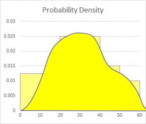
This curve represents a continuous distribution that might have produced the histograms we have been using; I tried to draw it so that the area under the curve between two values on the horizontal axis is the same as the area of the corresponding bars in the histogram (shown in the background):
At the end, I referred to some other sources, which go into more depth than I have, perhaps at the expense of clarity:
If you need more on either the meaning of a PDF in general, or on the relation of the normal to the binomial, see these pages:

  Normal Distribution Curve
    http://mathforum.org/library/drmath/view/57608.html

  The idea of a probability density function
    https://mathinsight.org/probability_density_function_idea

  Probability density function
    http://en.wikipedia.org/wiki/Probability_density_function
Apparently I guessed right about what was needed:
Thanks, Dr. Peterson. That was the exact explanation I was hunting for.

The doctors of Dr. Math are brilliant at their explanations of mathematical concepts.
Thanks are always appreciated!
Excellent explanation.
Pingback: What is Adjusted Frequency in a Histogram? – The Math Doctors