Graphs are used to display data. But sometimes we aren’t quite sure what sort of graph will best represent the data (or what kind of graph our teacher is expecting). We’ll look at a couple questions asking when a graph consisting of lines should or should not be used.
Continuous and discontinuous functions
The first question is from a student in 1998:
Connecting the Dots

This particular question came up in my math class and I was wondering if you could explain the answer to me. My instructor was unsure of the answer also.

Some graphs of functions consist of dots. Others are lines or curves.  How do you know whether or not to connect the dots when graphing a real-life function?
As an example of such graphs, here are scores from the National Assessment of Educational Progress, first using only dots,
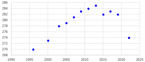
then lines,

then a smooth curve,
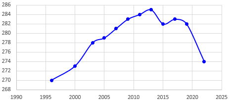
All of these are made by Excel.
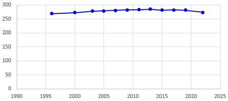
By the way, another issue that can arise is the fact that this graph is distorted by not starting the vertical scale at 0. Here is what it really looks like, showing better how large the changes are:
Some pure math
Doctor Nick answered:
Hello Kristine -

This is a very good question.

I think that what your question gets at is the concept of continuity.  A function is continuous if its graph can be drawn without taking your pencil off the paper. Well, that's the intuitive idea. A graph that's made up of isolated dots, or separate pieces is called discontinuous.

Now, there are ways to tell if a function is continuous. The study of continuity is a large part of the mathematical area called calculus.  With calculus, you can show that functions that are polynomials are continuous. Also, functions that are rational, that is, that are quotients of polynomial functions, are also continuous, at least in the areas where they are defined.

The trigonometric functions sine and cosine are continuous. The exponential function e^x is continuous.

Many other functions are continuous. Many are not. Determining whether or not a function is continuous can be quite tricky, but calculus is the place to start. Even if you're not quite ready for a calculus class (I don't know what class you're in now), you might like to take a look at a calculus text. The topic of continuity comes up right near the beginning, very much connected to the starting concept of calculus, the limit.
This is largely about pure mathematics (graphs of functions defined by an equation), rather than graphs of data as in the question; we don’t really need calculus for what we are discussing. But the idea of continuity is relevant in ways we’ll see more as we proceed.
An important factor to consider when graphing a function is the domain of that function. The domain is the set of values that can be plugged into the function so that it returns a real value. For instance, the domain of the function

   f(x) = 3*x

is the set of all real numbers, since 3 times any real number is a real number. Considering the graph of this function, we know the points (0,0) and (1,3) are on it. Since the function is a linear function (we know that y=3*x is a straight line), we can "connect the dots" (0,0) and (1,3) since every x value between 0 and 1 is in the domain of the function, and so for every such x value there is a corresponding y value on the graph of f.
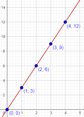
Every point on this line represents a value of the function, not just the dots.
Now, in the "real world" we sometimes run across functions for which the domain is not all real numbers, even though algebraically it should be. For instance, we might be told that the number of cars produced by a factory on a given day is c(x) = 3*x where x is the number of days from today. That is, today no cars are produced, tomorrow 3 cars and produced, 6 the day after that, then 9, etc.

Generally speaking, the function 3*x has the domain of all real numbers, but here we are given the extra condition that x is a whole number. The graph of this function then consists of the points (0,0),(1,3),(2,6),(3,9),(4,12), etc. - isolated points. In this instance, it would not be correct to "connect the dots" since values of x that are not positive integers have no corresponding y value.
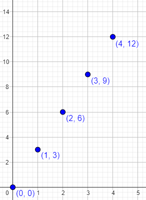
Note that the independent variable, x, represents the number of the day; cars are made on day 0, day 1, day 2, and so on, but not on “day 1.25”!
Real-world math is a little different
But the number of cars produced from a factory won’t typically come from an exact equation:
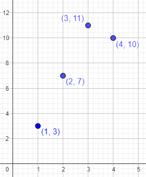
Often "real-world" functions are presented as data rather than as algebraically expressed functions. We might know that on day 1, 3 cars were produced; on day 2, 7 cars; on day 3, 11 cars; on day 4, 10 cars; etc. These data define a function f(x) where x is a positive integer: f(1)=3, f(2)=7, f(3)=11, f(4)=10, etc. In this case again the graph is a bunch of isolated points, and connecting the dots would not give a correct graph.
If we want to show only the actual data, then the dots are all we have! Anything more is sort of a lie …
However, for aesthetic (or other) reasons, people often do connect the dots of such graphs. This is implicitly creating a new function, say g(x), where g(x)=f(x) if x is a positive integer, and if x is not a positive integer, then g(x) is the y-value of the point (x,y) lying on the line connecting the two points on the graph (x1,f(x1)) and (x2,f(x2)) where x1 and x2 are the integers immediately less than and greater than, respectively, x.
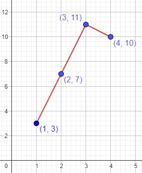
The lines here don’t represent real information; they just tie the data together, perhaps to show a trend, or perhaps just to make it easier to see how the dots are related. Is that enough reason to draw the lines? We’ll discuss that more below.
Another way to make the data stand out would be to use a bar chart:
In all cases, remember that a graph (in the sense here) is a pictorial representation of a function. It is a way of communicating information about that function. Regardless of the method you use to create the graph, if the graph communicates the right information, then it's a good graph.
So, what information would you want the graph to convey?
Discrete and continuous data?
Our next question is from a teacher in 2012:
Times that Call for Line Graphs?

Other teachers around my school say simply that if a graph measures time, then it is continuous data. The example usually given is the height of a plant over, say, months, measured on the first day of each month. It is often debated whether or not time or height is what is being graphed.

I have taught students that a line graph is used because we can estimate a height in between measurements -- continuing the plant growth example, for instance, we could estimate height on the 15th of the month as falling somewhere between points on the line.

Now we have a problem in which a swimmer records her times swimming daily, measured in minutes rounded to the nearest tenth.

Discrete or continuous?

It seems that each day's measurement is a discrete packet of data, especially given that the times are rounded. The swimmer leaves the pool between dates, so there is no swimming between calendar days; and the answer 23.005 is not possible. Twenty-three and a half, however, would be.

Also, it seems the answer could only range from 0.0 to 1440.0. Between the rounded times and a maximum amount, is it continuous or discrete?
Here the question is about continuous vs. discrete data, rather than continuous functions, which is a slightly different concept. Yet we’ll be coming back to the latter.
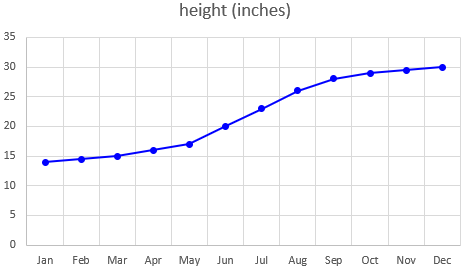
Consider first the tree-growth example :
There are several different issues in view here: The fact that time (on the horizontal axis) varies continuously is supposed to justify the use of a line graph, but is that really valid?
And what about the quantity being measured (on the vertical axis) being rounded, or having a restricted range (bounded)? Is that significant?
There is a big difference in the way we are thinking of time in the swimming-time graph; but first, there is some uncertainty about exactly what is being graphed. “Times swimming” might mean either the total time spent swimming for a day (which is likely to vary erratically), or the time for some particular distance (which might be expected to improve bit by bit). Which is intended? The suggested maximum of 1440 minutes (which is 24 hours) suggests that it is the former, so I’ll be going for that (which is more interesting anyway, as it is different from the growth example). But I’m not entirely sure, because who could (or would) measure their time in the pool to the nearest tenth of a minute? So I’m vacillating even as I write this.
I answered:
Hi, Sam.

I think a lot of the information out there about graphing for kids is oversimplified. A lot of the "rules" are not really as absolute as they are made to sound, and even basic concepts like "continuous data" are not always what they seem.

Apparently, you have been told that a line graph should be used only for continuous data. But a line graph relates TWO variables (commonly time and your actual data); and what really matters is whether the way in which those variables are RELATED is continuous or not. You can use a line graph whenever it will not give a wrong impression about that relationship.
The relationship is the function, not just the data.
Your first paragraph above is good -- the issue in graphing the growth of a plant is not really whether the variable "height" (or, for that matter, "time") is discrete or continuous, but the fact that it makes sense to approximate the continuous PROCESS of growth by a series of straight line segments (which in fact has the name of "linear interpolation").
So in my tree growth graph above, although, most likely, measurements between the actual measurements would not exactly fall along those lines, it would probably be not far from them. They are reasonable approximations.
As for whether you are graphing time or height, that's just a matter of semantics. Really you are graphing height vs. time! Both variables are involved in the graph.

I think it would make more sense to say that you are graphing height (the dependent variable) if you are going to mention only one, especially since time is commonly assumed as the independent variable. But that doesn't mean that what matters is whether the height is discrete.
It’s worth noting that in the question about a swimmer, both independent and dependent variables are times; this is probably part of Sam’s confusion. The times on the horizontal axis are discrete (just the day, not a particular time in the day); the times on the vertical axis are continuous (though rounded for the sake of measurement).
As for the swimmer's times, I was initially unsure whether the times recorded are the total time spent in the pool each day, or the time to swim a lap. Your later comments made it clear that it's the former, which raises more interesting issues anyway, since the latter would behave like growth in height.
Here’s a possible graph, for now in the form of a bar chart:
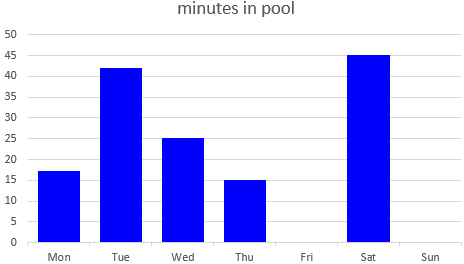
So you are graphing amount of swimming vs. days. The issue is not that the data is rounded or that it is bounded; that will be true of ANY measurement, and was just as true of the height measurements. What does matter is that each measurement is not just taken at a moment (how good are you at swimming right now?), but over an interval of time (how long did you spend in the pool today?).
This is what makes a bar graph, in particular, seem more appropriate.
Again, it's not just that the times are discrete (they were in the height example, too, being made once a month), but that the MEANING of the measurement would change if you chose a different set of times. That is, if you recorded twice a day, you'd be recording the amount of time in the pool in the morning and in the afternoon, rather than over an entire day. I think your comment about "no swimming between days" relates to this. Each day's measurement relates to the entire day as a unit, not to a moment during that day.
In the height example, the times, though discrete in practice, represent a sample from a continuous time; here, the reported amounts of time are inherently discrete, and in fact are something more like a rate: the number of minutes per day spent in the pool. If you recorded them twice a day, they would be minutes per half-day.
So the TIME (day) here is discrete, while the DATA (time in the pool) is continuous, in spite of the rounding. But it's not really the discrete times that make a line graph inappropriate; rather, it's the fact that it would be meaningless to ask how much time she spent in the pool on Tuesday-and-a-half.
The absurdity of even saying that makes it clear. In a line graph of this, a point in the middle of the segment from Tuesday to Wednesday would not be an estimate of a measurement at a previously unmeasured time; it would represent a meaningless quantity.
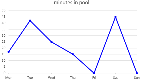
I'd probably use a bar graph for this. However, I don't think it would be a major error to use a line graph, especially if the point of the graph was to show a trend to spend more time in the pool as she gains experience as a swimmer, or something like that. My main reason for choosing a bar graph is that I'd expect the times not to show a trend, but to vary somewhat erratically (e.g., high every Tuesday, low on holidays).
A line graph would be more meaningful over a longer period of time, such as if we graphed the average number of minutes per day in the pool for each week. This would smooth out the expected daily irregularities, and show a long-term trend. (That’s something I do in examining the usage of this website, for example.)
What do educators say?
For questions about what should be taught, I like to do a little research to find what is taught, so I’m not just giving my own opinion. The evidence I found then, 11 years ago, is not all current, but suggests some ideas worth thinking about.
First, from Canada:
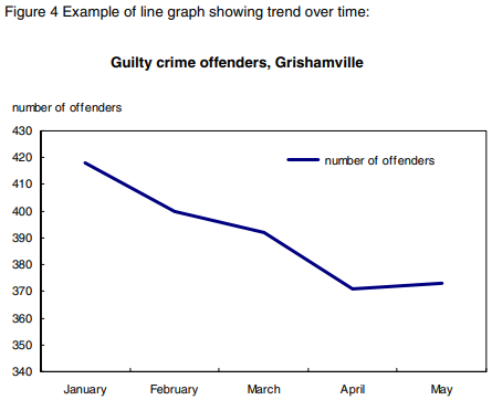
I looked around to see what is said about line graphs and discrete or continuous data, and found this page that explicitly states that line graphs are used for both, and gives examples where either the data or the time is discrete:

  Statistics Canada: Teacher's Guide to Data Discovery
  http://www.statcan.gc.ca/pub/12-593-x/2010001/concepts-eng.htm

Note the graph of number of offenders vs. month, which is somewhat like our example.
(The original link is dead; I located what I think is the same document elsewhere on their site, and replaced it.)
The emphasis here (pp. 14-15) is that line graphs show a relationship between two related variables – either something like height vs. age, or, as here, some quantity vs. time, which presumably shows a trend of some sort (or, sometimes, the lack of a trend, which can be equally significant!):
(This source doesn’t show the equivalent graph without lines; for that, they use bar graphs.)
Second, from New Zealand:
The following page gives some guidelines for deciding whether to use a line graph, which shows much greater subtlety than we often hear, though even here I'm not sure I agree:

  Assessment Resource Banks: Types of Data
  http://arb.nzcer.org.nz/supportmaterials/maths/Types_of_data_statistics.pdf

--------------------
It is acceptable to draw line graphs or histograms if the horizontal axis (x-axis) is measurement (continuous) data [or "near continuous," i.e., has a large number -- at least 10 numerical categories].

Do not use line graphs with discrete data on the x-axis, especially if the data is unordered category (nominal) data. The exception is when you have a large number of categories of whole number data (e.g., number of children in different classes).
--------------------
Our swimming example involves discrete time on the horizontal axis, but if continued over enough days, could be called "near continuous." The main reason for using a line graph would be if it shows a trend.
(I’ve replaced the old link with one at archive.org, because I couldn’t find a current version.)
This emphasizes the type of data, rather than the type of relationship. The focus of this article, in fact, like the other two, is on types of data; I plan to examine that concept next time.
Finally, also apparently from New Zealand:
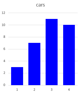
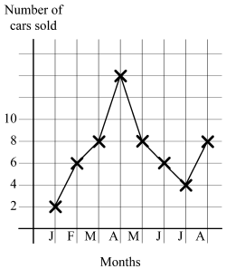
Here's one more reference relating to the data itself being discrete:

  Unit 3: Data representation
  http://wikieducator.org/images/9/90/JSMath6_Part2.pdf

--------------------
If trends -- changes over time -- are looked for, line graphs can be used. Line graphs are used for both discrete and continuous data. For example, in the line graph is displayed the number of cars sold in a certain garage over the first 8 months of a year. Although "in between" values such as 2 1/2, 3 1/4, etc., do not exist, the points are joined with straight lines to show the trend. For trend lines, not all "in between" values have to make sense.
Here is their example (from p. 13):
I hope this helps a little, if only to defuse some of the debates over application of unnecessarily rigid rules.
What kind of graph should you use? Focus on the relationship, and whether you are adequately representing that.
Pingback: Types of Data: Discrete, Continuous, Nominal, Ordinal, … – The Math Doctors